What are Overlay filters?
With the use of overlay filters, users can choose multiple filter tree values and have all matching results displayed. They always have the option of eliminating some of the chosen possibilities if they want to narrow down their search.
Why should you enable overlay filters on your Shopify store?
According to Smashing Magazine, as many as:
- 42% of major e-commerce websites lack category-specific filter types,
- 20% of top e-commerce websites lack thematic filters,
- 32% of websites either have inadequate truncation design
and the list could go on and on. Baymard, in reality, found that only 16% of the sites under analysis offered a good filtering experience.
In summary, utilizing Overlay filters will enable you to successfully compete with the biggest online shops in the world in this market.
But let’s delve a little deeper and discuss some of the precise advantages of using overlay filters.
- Improved navigation. You want both new and returning site users to have an easy time navigating your online store and swiftly finding the products they’re looking for. You may greatly simplify and ease the navigation of your online store by using overlay filters.
- Enhance the product’s visibility. Customers in your online store can easily find products thanks to overlay filters. This not only boosts sales but is also a terrific technique to make less well-liked products on your online store more visible. You may take things a step further by adding a “Featured” filter to draw more potential customers’ attention to them.
- Optimize the shopping experience. Any successful eCommerce site must provide a positive user experience. If customers have trouble locating what they’re looking for on your site, they’re more likely to leave. But by employing filters, you give all kinds of users – even those who aren’t tech-savvy – a simple way to quickly find the things they need. You can increase customer retention by doing this.
- Stimulate more purchasing. The use of overlay filters on your online store promotes more purchases, which eventually increases your company’s revenue. Customers will move on to the next eCommerce site if they can’t find the items they’re looking for when exploring your online store.
Examples of Overlay filters
Amazon
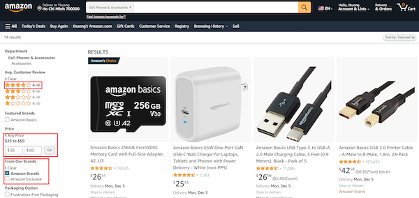


When you search for a product on Amazon (through my instance, the telephones & accessories category), a range of options is immediately displayed.
The whole product filter area is conveniently located on the left side of your page, where you may select from “Customer review,” “Price,” “Brands,” “Availability,” and a number of other options. As you browse the entire list, it becomes clear that Amazon adheres to the principle “more is more”.
It was interesting because, for each category of men’s shoes, I could choose from a variety of filters. But I could only buy one item from each category of earbuds when I went shopping.
This demonstrates that, in order to provide the greatest experience for each category, Amazon offers several filtering options for various product kinds.
Finally, all Amazon product filters are displayed thanks to distinctive meta tags. Due to the enormous number of products listed on Amazon, it is crucial that the filters are adjusted to prevent duplication. Amazon uses overlay filters rather effectively in terms of both layout and functionality.
Wayfair
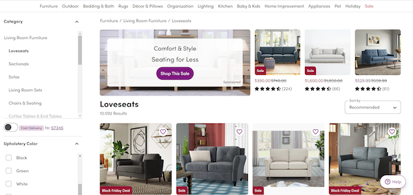


Another online store that used efficient truncation was Wayfair. The “Show More Filters” option is still available, though. You can click the plus symbol to hide the lengthy list of filters if you don’t want to view them.
The filter tags are practical and come with a few special extras to aid clients in their decision-making. For instance, adding dimensions will allow you to select the sofas that will match your room the best.
At the top of the page, all of the major categories are visible. You can then click on that particular category, followed by the subcategory, to look at further furniture if you wish to purchase anything else or are just interested in browsing other options.
Best practices to apply Overlay filters on the Shopify store
It’s surprising how few online shops allow customers to choose multiple filter values for some filter categories. Since many options are mutually exclusive, if you want to expand your search, you must discard the first value and apply another, while keeping in mind the outcomes of the first value.
The finest advice that Shopify owner stores may do to keep their customer retention rates high is provided below:
Collapsible filter options
Make the view of the applied filter extremely clear. eCommerce sites frequently offer filter checkbox user interfaces that make it clear that a few filters are in use.
Display applied filters
Almost all websites confirm the selections made where the filter was initially applied when users apply filters to product lists; for example, a desktop website would put a checkmark to the filter option checkbox.
However, after extensive UX testing on both desktop and mobile devices, the lack of an overview of applied filters led to problems, including slowing down the process of modifying the product list and, in some cases, leading to disorientation.


