


It is obvious that filtering is important for the company. However, only 16 percent of eCommerce firms offer helpful filtering options to customers. In this article, we’ll look at how you can make your eCommerce filter UX better so that it’s easier for customers to use.
What is Filter UX?
Filters are an excellent tool for reducing large amounts of content and surfacing the most relevant results.
Because it makes it easier for customers to locate what they are looking for, filter UX is crucial to the customer experience and can enhance conversions for retailers.
On larger displays, there are two common layouts for filtering:
- A horizontal toolbar above the product list
- A vertical sidebar to the left of the product list
Consider offering both layouts as a choice behind a theme setting to offer flexibility for various merchant needs.
Horizontal toolbar filter UX
Although it works best for smaller stores with less than five filters required at once, a horizontal toolbar above the product list can offer a convenient entry point for both filtering and sorting.
Vertical sidebar filter UX
The optimum arrangement for stores with more than five filters is a vertical sidebar to the left of the product list.
What makes Filter UX important to your Shopify store?
The best user experience for filtering eliminates the need for users to “learn how to filter.” In fact, the more flexible the filtering interaction, the more psychological effort they’ll have to devote to selecting their desired outcome (s).
Let’s help people accomplish their objectives in the least stressful method feasible rather than wasting their energy on a burdensome encounter. There are 4 main reasons that Filter UX matters as follows:
- People are easily overwhelmed with possibilities, so Filter UX makes it simpler for users to narrow their selection of products and increases conversion.
- Product discovery is matched to customers’ intentions by filtering.
- It makes navigating an eCommerce website easy and seamless.
- Filters reduce the amount of time that customers must spend looking for products, speeding up the checkout process.
Filter UX Examples
Live-filtering
The data is updated to display the filtered results as soon as the user makes a selection. This is expected for lower-stake interactions like choosing a filter from a short list. You could require more friction, such as using a secondary trigger, whenever you’re working with multi-select filters or more complicated inputs.
Per-filter
Applying the filters one at a time is the best intermediate choice in this case. If you allow the user to choose their final option.
For example, with a multi-select dropdown, they may search, browse, and select what they need without being distracted by the results automatically updating. When they are through with that specific identifier, they can then start the results. This can be done by either clicking outside of the dropdown and closing it or by hitting an inline “Apply” button.
Batch-filtering
The third choice is to merely retrieve the results once. The user would explore the numerous dropdowns, perform a search, and scroll before finally clicking the global “Apply” button after entering all the appropriate filters.
Related terms to Filter UX
Filtering or sorting UX?
Theoretically, they are distinct from one another since filtering obscures content while sorting arranges it in accordance with a particular criterion.
However, research indicates that the user’s experience is essentially identical in that both expose the most pertinent content in conformity with their criteria. Even during user sessions, Baymard has seen that certain users frequently confuse the terms “sorting” with “filtering.”
Filters of the same “type” (such as “Price”) make sense for sorting. Instead of making visitors choose between a narrow range (by selecting $0-20, $20-40…) and a wider range (by categorizing prices from low to high), this enables them to browse the complete spectrum.
For filters that might be mutually exclusive, filtering is a better choice. Even if we could arrange pants by size, it would not be very helpful to see jeggings on top and those extra-baggy early 2000s jeans down the bottom.
Filter UX best practices
1. Choose the ideal location
As you can see on Amazon or eBay, filtered navigation is typically located in the left sidebar next to the content on e-Commerce websites. It’s not always the greatest option, though.
According to usability studies on filtering conducted by the Baymard Institute, a horizontal navigation bar placed above the content frequently outperforms other options.
For e-Commerce websites with fewer product filters, horizontal navigation typically works effectively since customers are less likely to forget about the filters.
Given the potential for significant variations in conversion rates, it is usually worthwhile to test the placement of the filtered navigation.
2. Offer relevant filters
Although it’s worthwhile to investigate the filters your rivals employ, filters should always be pertinent to your offerings and target market alone. It’s not always as simple as you might imagine because you need filters to respond to the inquiries clients make when looking for your products.
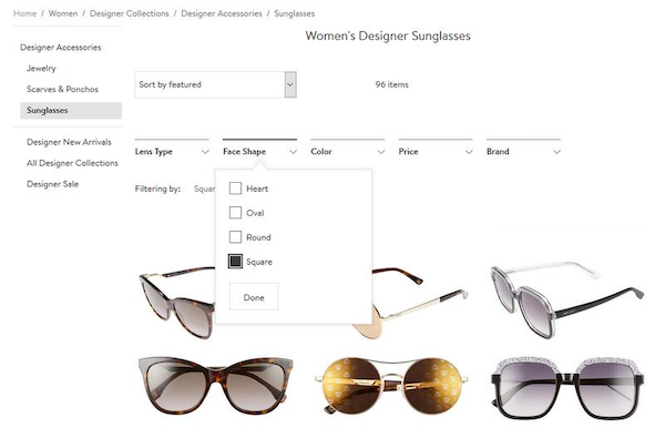
As an illustration, Nordstrom offers its clients carefully chosen filters for each product category, such as “lens type,” “facial shape,” “color,” “price,” and “brand” for sunglasses.
3. Enable customers to select multiple filters
Many visitors come to your site with well-defined thoughts and desires, even while some just peruse it at random. In order to perform a query simultaneously for several criteria, such as color, price, and material, this client group typically wishes to use many filters at once.
They must be given the option to choose filters of the same kind in addition to distinct filters from various filter groups.
4. Allow manual input if needed
Although checkboxes are an excellent way to retrieve filter values, there are occasions when it’s also a good idea to let users manually define filters, as is the case with price input fields. Setting up price filters correctly might be challenging because every consumer searches for products within a different price range.
The price filtering user interface on eBay caters to two distinct consumer segments: those who are happy to rapidly check a predetermined price range and those who would want to manually enter their own minimum and maximum prices into the available text input fields.
5. Make a product counter visible
By putting up a product counter, you can let your customers know how “good” they did with their filtering efforts in addition to keeping them updated, which naturally fosters confidence.
Before making a purchase, each consumer has a list of products they wish to investigate. The goal of filtering is to get them as near to this number as possible. If you provide them with a product counter, they can quickly determine whether they have applied enough filters or whether they need to perform the query again.
Every eCommerce site should display the number of products that fit a particular filter setup.
6. Establish logical filter groups
Customers must have access to all the filters necessary to make an informed purchasing decision on a well-converting e-Commerce site; this is crucial if you sell high-end goods. It’s essential to organize the filters into sensible groups in order to maintain the filtered navigation organized and user-friendly.
8. Take thematic filters into account
Customers can do searches based on various themes, such as “summer arrivals,” “on sale,” “casual style,” or “last-minute offers,” using thematic filters, a special category of product filters. Thematic filtering is not always used, even on large e-Commerce sites.
9. Show filtered selections
A feature that can greatly enhance user experience is the display of the filters users have applied next to the query results. This is because many users have a tendency to forget what they recently searched for. Your clients will have less confusion as a result because they can always review and change the criteria they previously chose.
As many people tend to forget what they’ve just searched for, displaying the filters they’ve applied next to the query results is a feature that can significantly improve user experience. This way your customers will feel less lost, as they can check at any time the filters they selected earlier, and modify them when it’s necessary.
10. Highlight popular filters
Every eCommerce website has its own well-liked themes, such as fashion, a season, or a limited-time deal. To make it easier for your consumers to find them, you can apply a themed filter to each of these themes and set it on top of the filtered menu.
You can alter your most popular filters over time depending on shifting client behavior trends on your site if you want to be even more professional.